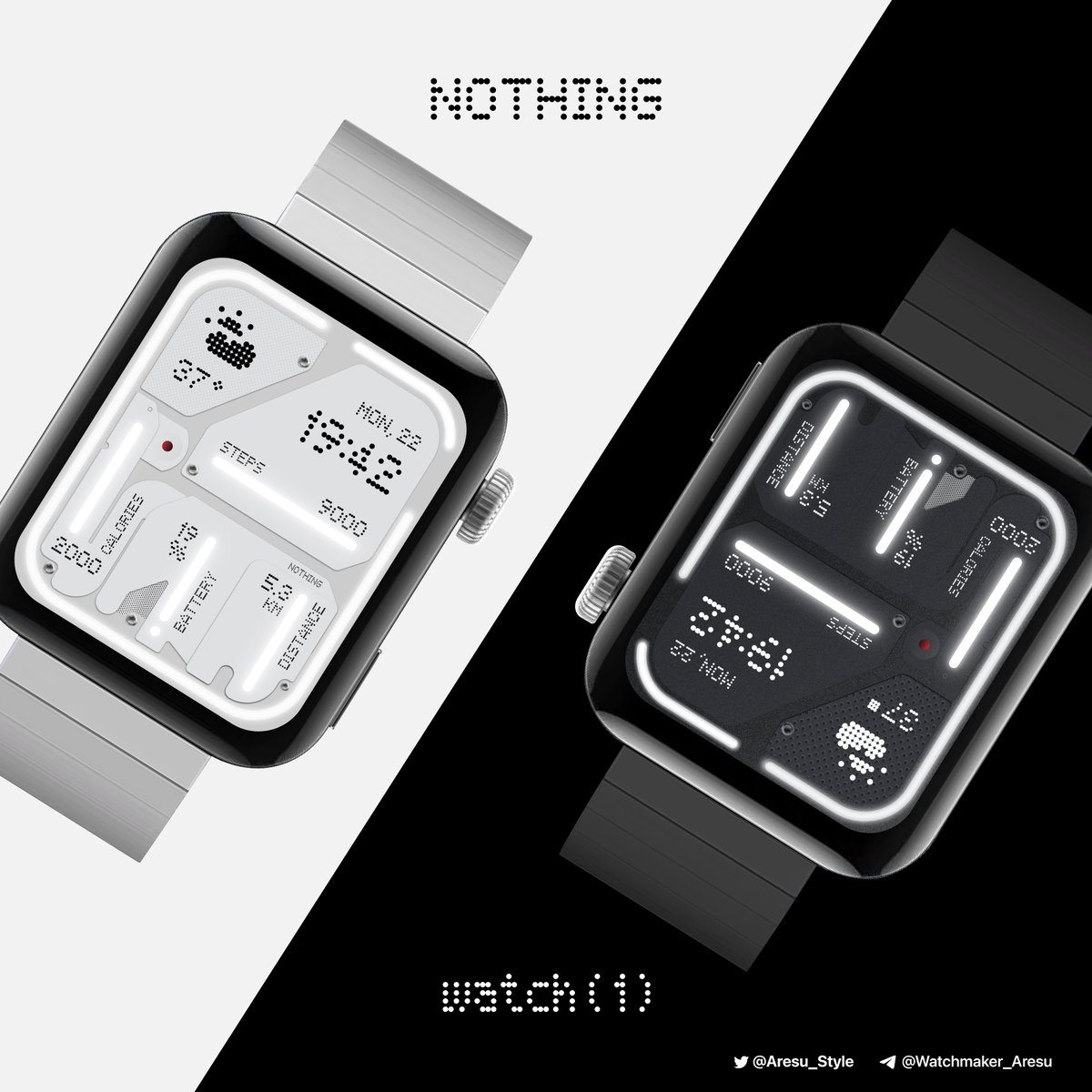
Can You Imagine a Smartwatch with a "Nothing" Interface?
 |
| Concept for Nothing Watch |
Tech company Nothing has made waves with its transparent phone design and focus on simplicity. But what if they took their design philosophy to the wrist? Let's delve into the world of a hypothetical "Nothing Watch" and explore how it might look and function.
Transparency Takeover
Imagine a smartwatch where the watch face is actually a transparent window into the watch's inner workings. We could see glimpses of the gears and circuits, echoing Nothing's signature aesthetic. This transparent theme could extend to the watch strap, showcasing the materials and engineering beneath a clear, flexible material.
Glyph Guidance
Instead of a cluttered screen, the Nothing Watch might utilize Nothing's now-famous Glyph interface. These tiny LEDs embedded in the display could represent notifications, fitness goals, or even weather conditions. Imagine a pulsing Glyph for an incoming call or a series of Glyphs forming a progress bar for your daily step count.
Focus on Function
A Nothing Watch would likely prioritize core smartwatch functionalities. Think essentials like activity tracking, heart rate monitoring, and notifications. The interface would be stripped-down and user-friendly, with an emphasis on quick access to information and controls.
A Glimpse into the Future?
A Nothing Watch is purely speculation at this point, but it highlights an interesting direction for smartwatch design. Maybe it's not about cramming more features onto a tiny screen, but rather about creating a seamless and intuitive experience that complements our daily lives.
Would you wear a Nothing Watch? Share your thoughts in the comments! Let's discuss the future of smartwatch design and whether "less is more" could be the key to a truly innovative wearable.
